I submitted my final piece ready for formative assessment and a week later I received the feedback for my piece. The tutor pointed out improvements that could be made:
- The final 2 spreads could have a stronger balanced path for the eye yet could be more dynamic
- The style of illustration on the final spread feels very different to the remaining spreads
- Watch out for type detailing and use of grid system on spread 1
- The kerning in the standfirst on the first spread feels very wide throughout
- Rag needs more development
- Reduce the point size of the body copy
With so much I felt I needed to improve on from the constructive and detailed feedback, I decided to create a new document. First I decided that I needed to change the construction of the editorial piece. Instead of using the 6 pages available as three double page spreads, I decided to switch to using two double page spreads with a back and front cover. This would make it easier for me to create constructive double page spreads while still keeping the illustrative elements of the piece and the important role they play in portraying the concept in the article.
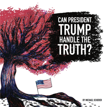
I decided the title page didn’t fit together with the remaining pages. Instead of using the rectangular boxes to highlight the text on the title page, I decided to use chalk to create a blog of colour so that it would stand out from the background. This fit well with the fact that I used chalk in the ‘TRUTH vs TRUMP’ typography.
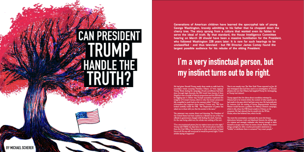
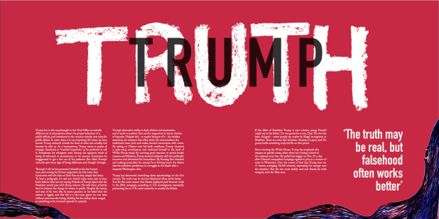
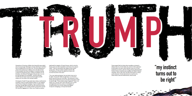
For the first double page spread with the ‘TRUTH vs TRUMP’ typography, I decided to switch the colour of the background to white. With the name ‘TRUMP’, I therefore used the cherry red in that piece of text along with a white copy of that to see the clear different between ‘TRUTH’ and ‘TRUMP’. I enlarged the word ‘TRUTH’ to make the page look more dynamic, as well as adding bark and dead blossom which I drew with a black ink pen to demonstrate the lead onto the next double page. I used a shorter quote to the one I had previously used in this spread so I could make room to enlarge ‘TRUTH’ and include the root and blossom at the bottom.
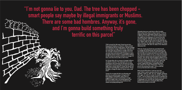
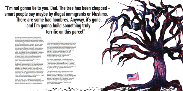
For the next double page I changed the background colour to white, got rid of the illustration from the previous design, and drew a dead tree in the style of the illustration on the front cover of this design. With the addition of the dead blossom I had drawn, this added to the effect of the tree looking dead. I had the tree facing to the left so it directed the reader to the left page. This made a better path for the eye. I kept the same quote as well.
For the back cover I decided not to incorporate any images or illustrations into it. I decided to have one column of text on the left hand side of the page. On the right hand side is the last quote from President Trump that was featured in the final paragraph of the article. To add decoration to the final page I add a small flick of chalk to go underneath the quote. This made the page look minimalistic but rebellious which made the page look more interesting.
I packaged the document ready for printing on A2 sheets. Unfortunately I had to go and reprint my pages because I didn’t make the correct calculations of the measurements of the double pages on single A2 sheets. I save money I decided to bring the measurements of the pages down from 315 x 315mm to 290 x 290mm. This saved me half the price I would have had to pay for A1 sheets. By decreasing the size slightly, it meant I had to decrease the point size of the body copy from 11pt to 10pt. This meant having to edit the type detailing again. I kept the same size of the margins and gutters.
After getting the pages professionally printed we folded the pages with a bone folder, used a scalpel to cut the edges according to the crop marks shown on the page, and used spray adhesive glue to stick the pages back to back. This involved using a great deal of judging the accuracy of cutting and lining up pages.
What I thought I could improved on in my final piece was exploring the use of more dynamic layouts that I could have used. I also would have liked to experiment with screen print and letterpress to make even more interesting typography for the entire piece. Unfortunately I didn’t make time to make screen prints and interesting typographic work. I felt strongly that I had ignored typography in this project. I struggled very much with type detailing in this project, although I think this was mainly down to the vast amount of lengthy words the author had used in the article. It took up a surprising amount of time to fix the type detailing for working with this article in my design. I also found it difficult to produce a front cover for the very final design. At some points I considered getting rid of the original cherry tree illustration because of how difficult it was to make it look prominent on the title page as well as including the title. However, I am particularly proud of the amount of effort and of how successful the illustrations were in portraying the key concept presented by the author in the article.