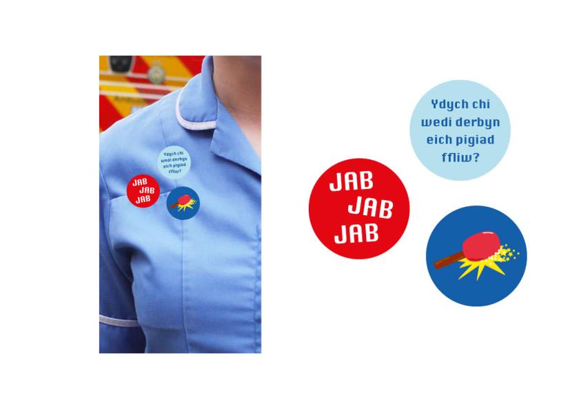
I had reflected upon the outcomesI had designed for the campaign andhad noticed several things I could have changed. For the plasters and stickers,I changed the image of the jabber to go with the theme of the game to the germs which popped out the game.Another benefit of using the characterised germs as the ‘mascots’ for the campaign was that the campaign could be developed and built upon in numerous andadventurous ways. Keyrings, plushies, colouring books, and animations could be developed as part of the identity for the campaign, which would above all make the campaign family friendly. I had then changed the hashtag featured on thepale blue plaster to #jabthegerm.These small difference had madea significant improvement in imageto the identity of the campaign,making everything fit together.
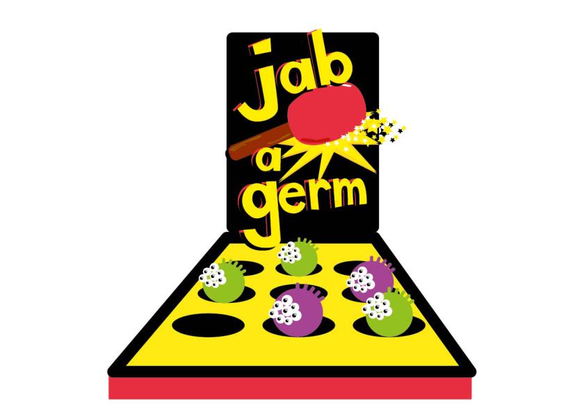
Having changed small features of theplasters and stickers according to the design of the identity of the gameand the characters within the game,I then changed the colours of the game to fit with the background colours of the plasters. I didn’t however change thecolours in the logo. I attempted to replace the yellow with the blue, however,when placed against the arcade game it blended seemlessly which made it hardfor it to stand out against the background.
Taking a break from the rush of work at the end of my second year, I decided to take a look at the Graphic Communication Undergraduate Degree Show of 2018. I was really impressed with how much larger the space was for the graphic communication course which was a huge improvement from the cramped space the class had last year. Everything was spaced out nicely so that it gave viewers space to walk around without bumping into one another. I also feel it gave the viewer breathing space. The variety of work was really refreshing and every student had a different outcome to the previous work I had looked at.
Several features that made the exhibition more interesting to look at compared to last year included a cluster of prints hanging from the ceiling, a timeline designed in the shape of a donut, and a number of dissertations designed into a book written by each of the students. I have focused on three pieces of work by students that had caught my interest at the show.
The first piece of work that caught my eye as I entered the exhibition space was this spread of colourful and vibrant typographic posters. I like how different modifications were made to the words on the posters according to morphing the text, the layout on the page, the typefaces used, and the colours which reflected the issue of equality for women.
Another piece of work which had caught my eye in the same space of work was a piece of editorial named ‘Journal of Unexplored North Wales‘. What caught my eye into wanting to look at this piece of work were the stunning photos that were presented on the wall along with a journal on a pedestal. As I delved deeper into the journal I had come across countless pages which had featured sophisticated stylistic typography which had reflected the very essence of what ‘unexplored’ adventures there were to find in the North of Wales. The photographs were edited to match with the stylistic type created for the journal. Small maps had been carefully constructed to encourage viewers to read on to the adventures within the book. I really liked how text had twisted round each other and been placed in photographs as well.
As I stepped into the other space I had found another piece of design which had immediately caught my eye. This piece of design was titled ‘The Space Race‘. It was an editorial piece on The Space Race during the Cold War of which is focused on the political issues between the USA and the Soviet Union. What I like about this piece is how bold the typography was within the editorial. By combining that with black and white images, it made for an interesting piece of communication.
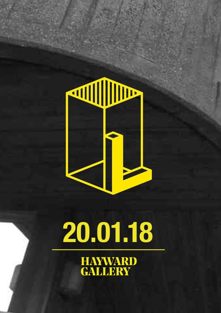
Before thinking about how I was going to incorporate information into a poster together with the pattern, I first lookedat how I could minimise the amount of infomration on the poster. By doing thisit would follow the minimal style that Ihad looked at in my typographic posterresearch, by using negative spaceby giving the viewer breathing space.The complexity of the pattern wouldcounteract with the minimal amount of information on the poster creating a nice contrast, yet ultimately complimentingthe texture of the concrete buildingphotographed in the background. By only using the marque I had created for theexhibition, the date it would be opened, and the location it would be held in,it made the event seem like more of an iconic event, making the postermemorable.
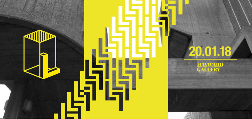
By making use of the pattern and thesingle poster, I designed a triptych ofthree posters. On the far left poster I placed the marque of the exhibition that I had designed. The middle features the stencil of the original pattern, and the far right featured the opening date andlocation of the exhibition. I had used the whole photograph taken of the Hayward Gallery which I had used for the identityof the exhibition for the background ofthe triptych. I also decided to place the stencil of the pattern in the center poster because there were more white areas within that area of the photograph.This then allowed for the texture of the concrete to peek through what holes there were in the stencil, as well as allowing the minimal amount of information on the side posters to compliment the texture and structure of the building.
Because the pattern within the stencil had formed a path that anticipated to had been carried further onto the side posters,I then used the original pattern to carry that pattern on. This would make theposters seem more like a set of posters rather than seperate ones.
By using the image I had used for the background in previous designs, which I took off the Hayward Gallery website, I first started to create a pattern in Illustrator and adapt and change it to suit the style and construction of the image. I had to keep in mind that I didn’t want to direct the viewers attention to somewhere other than the black and white photograph, which was extremely hard to do, so I had to change the position and complexity of the pattern to compliment the detail within the photo of the concrete building in the background.
At first I worked with a stencil of the pattern, which featured the letter ‘L’ placed amongst each other, rotated into the crevices and joints of the rectangular elements of the letter. I had not yet started to place information into the design of the poster because I wanted to learn how the design of the pattern wouldn’t gain more attraction than the photo. I worked with the colour I had used for the design of the logo so that the style of the posters would remain consistent with the design of the remainder of the identity, ephemera, and signage I had created for the exhibition. After a reflection of the stencil of the pattern that I had placed on top of the photo, the design was far too eye-catching compared to the black and white photo in the background of the poster. Unless I perhaps wanted to produce a series of posters which would be placed together.
I then used the original pattern I had created and not the stencil. Again I had changed the position of the pattern on the page. I repeated the pattern as well so that it would layer on top of each other to make an interesting jumble of cubic shapes to reflect on the unicity of brutalism. It felt like a jigsaw at this point, and even looked like a map. And then I considered how the pattern could reflect the texture of concrete used in the design of a brutalist building.
I had then changed the opacity and positioning of the repeat of the pattern. I felt it added an unwanted amount of attention to the pattern because it created a certain amount of depth by layering it with the original pattern by making it seem oddly blurry from a distance. And by leaving it by itself in the centre of the page, I thought the identity of the exhibition would be ruined because it didn’t draw the same level of attention to the beauty of concrete and it’s texture as a the opaque pattern. By making the pattern almost translucent, it would make the viewer think as though brutalism should be translucent itself and that it shouldn’t be seen as a thing of ‘beauty’ or complexity, making it something that should be forgotten about.
Reflecting on the design of the posters I had created for the London in the Raw exhibition to be exhibited at the Hayward Gallery in the Southbank Centre, I had received feedback after I gave a presentation on my work to say that the variety of colours that I had used within the posters singularly and collectively as a series of posters directed viewers attention away from the ‘beauty’ of the black and white photo of the Hayward Gallery that was featured in the background.
The original designs for the posters I had created are below.
The colours I had used within the poster designs corresponded with the colours I decided to use within the digital piece of ephemera I designed. I had conceptualised an app which I looked at an idea for the main menu and the Kids section of the app which would allow a younger audience to become engaged in the theme of the exhibition.
Based on the feedback I had received for the design of the posters, I wanted to keep the colours the same within the app. I had decided instead to change the design of the posters. By changing the design of the posters, perhaps the design for the opening title of the app would change, or the design of the wayfinding and signage would change.
Before progressing further into redesigning the posters, I needed to look thoroughly at designs of other posters, and I more specifically wanted to look at how typography was used in the design of posters I had found online. I put together a Pinterest board and had chosen several that had drawn my interest to them.
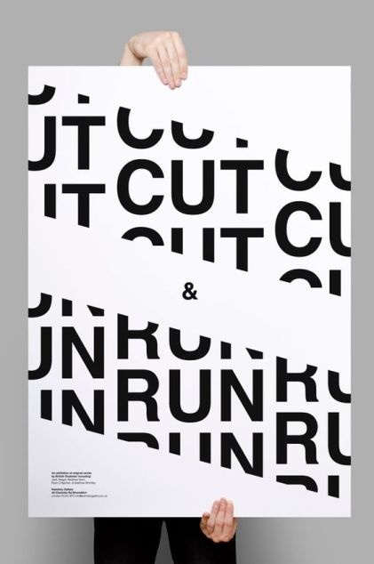
The first poster that had caught my eye was this typographic poster which taken my eye to focus on the ampersand placed in the very centre of the poster, between the two strips of text which had been cut off to create the impression of the letters being ‘CUT’ as put in the poster, and the word ‘RUN’ which links to the strips of cut text running diagonally across the poster. I liked how minimal the design was due to the sharp monochrome use with the san serif typeface that had been used throughout. The words within the poster ‘CUT & RUN’ remind me of the phrase ‘hit & run’ because it is so commonly used. Instead, this is advertising a creative exhibition. The lack of a variety of words direct my eye to look at the small description sitting in the bottom left hand corner of the poster.
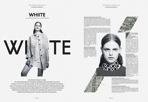
Instead of looking at a poster, I also decided to look at a double-page layout which featured black and white photos and bold monochrome san serif text. What I liked about the design of the left page is how the model is blocking out the centre of the word ‘WHIITE’. The image of the woman direct the viewer to want to look at the details of the woman’ face closer, guiding you to look at the photo on the next page and then the strip of texture in the background of what looks like vegetation. What really intrigues me about the design of the right page is how the text looks as if it’s been intentionally cut off by the image so the text doesn’t fit around the cropped image in the centre of the page.
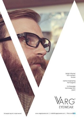
The design of the poster below reminds me of the design of the original posters I had created because of the diagonal strips on the page. Instead of using bold and vibrant colours, the designer of this poster has decided to use white to direct attention to the colours of the photo behind the shapes to form a sufficient background for the san serif text in the foreground which is advertising the glasses the model is wearing. What I don’t like about this is how the thin white strip blocks out part of the glasses, which detracts attention from the glasses. However, I do like how the design of the logo in the foreground of the first letter, ‘V’, is incorporated so well into the shape the designer created. It really creates a strong sense of value of the brand, making it seem like a luxurious eyewear brand. It seems as if the supreme design of the poster reflects the quality of the eyewear brand.
Another typographic poster which had caught my eye was a poster promoting a Bachelor of Design Show at the University of Washington. The choice of the sharp san serif typeface showcases the subject of design smartly and effectively. I really like how fragments of letters have been cut out and the opacity has been adjusted to focus on the curves, edges and corners of the shape. However, when you look closely at the opaque fragments of the letters they seem to be crosshatch lines. The letters spaced out in the top half of the poster spelling out the words ‘THE’ and ‘SHOW’ makes the poster especially eye-catching, particularly where small details have been added. I like how the poster would work well as a cluster of posters put together, when looking at where the ‘W’ has been placed at the top linking to the bottom of the poster. It breaks up the poster nicely and directs the viewers’ eye to look back on the details within the poster. What would be interesting to see is how primary colours could work in the larger letters which have been spread across the poster.
What I liked about the poster below was the flash of moroccan blue which layered opaquely on top of a corner of the black and white photo behind. The name in the top left hand corner of the poster in san serif typeface in white has also stood out to me. That same colour has been translated to the small piece of text sitting in the bottom left hand corner of the poster. I would like to consider how the identity of the London in the Raw exhibition could be changed by transforming the vibrant yellow of the logo and type to white to attract less attention to the colour and rather to the beauty of the black and white photo I would have placed in the background.
The poster below, again presents a strong sense of attention to the detail in typography, however the letters have been used and developed in the poster in an interesting way. By using the outlines of the letters the designer has created layers of the letters to create interesting new and unique shapes. The hierarchy of the poster is confusing, however the misleading hierarchy confronts the rules of design and instead questions how the subject of fine art can be used within the development of graphic design.
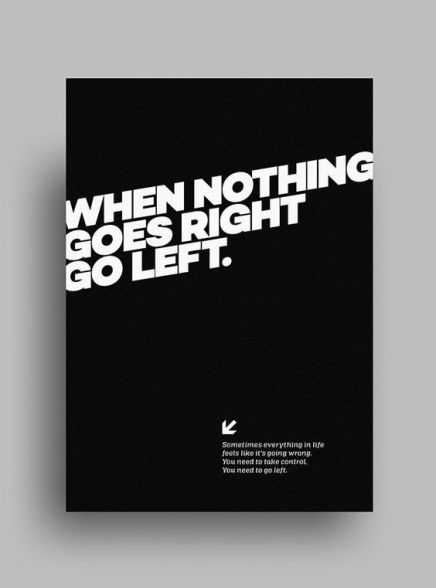
Finally I chose a poster that didn’t contain much information, nor many interesting elements. It was simple, minimal, and monochromatic, featuring a san serif typeface and an arrow pointing to the bottom left. I liked this poster for it’s simplicity. It has encouraged me to consider what small sentences I could use to represent the subject of London in the Raw. And the simple design of the poster has intrigued me as to how simple the posters I design could be to represent the exhibition, and particularly how a series of simple posters could promote the exhibition in a more effective way than individual posters.
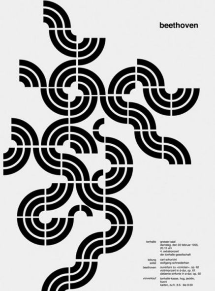
The design of the poster below had differed greatly to the mainly typographic posters I had chosen above. I liked the minimalistic approach it took to the subject of a series of classical orchestral concerts, one of which was a piece by Beethoven. The shapes used in the pattern reminded me of a vinyl record or a pattern from the 1960 which reflected a similar style to that of brutalist architecture. In the design of my posters, the design of this poster has encouraged me to look at how patterns I create could reflect the theme of the exhibition in an interesting and more artistic approach.
With several of the elements which had interested me from the posters above, I would like to explore similar techniques and tools that designers of those posters had used. These elements I would like to attempt to recreate to make the posters more interesting to promote the exhibition.
Upon reflection of my second year on the graphic communication course at CSAD, my final academic project of the year would require us to think to ourselves as to what sort of designers we wanted to be.
Upon the reintroduction of writing a manifesto, I looked back to a blog post named Design History Made I had written in my first year on the First things First manifesto, first published in London, 1964, and then republished in 2000. At first designers pleaded to organisations from across the globe to recognise the importance of images and their makers to sell or promote services. But in 2000, many more designers had then asked for their skills to be put to more essential use, to change the world in different and more effective ways so designers jobs wouldn’t be wasted on selling inessential products.
By reading back through this manifesto, it had given me inspiration into what to put into my own personal manifesto which I had written. By writing this it would give me a strong sense of direction as to what to put in my curriculum vitae in the future. It would give employers a strong sense of what values I have as a designer.
Within my manifesto I had discussed what passions I had, what experiences had influenced my decisions as a developing designer, what changes I wanted to make in the world through the power of being a graphic designer, what effects my designs would have on the world according to my passions, and what motivated me to want to become a designer. Most of my decisions within the manifesto I had written were based on the lack of inclusivity that graphic design offers to their audience and the consumer. And I also discussed the environmental and economical impact graphic design has on the world, and whether it is effective or not.
After presenting our work to the client I considered my work, how well I had done, what I could have improved on, and my experience of working in a group with a live client.
Three things that went well, individually and collectively in a group:
Everyone that had put work together and presented in the presentation all had a great amount of things to say regarding the effectiveness of their work. We all understood each others’ projects and communicated clearly what audience we wanted to target and why.
We all worked really well with the client and communicated well, finding common ground with interest in brand new concepts and ideas.
We had supported and shared each others ideas giving constructive feedback and valuable criticism which had informed our outcomes really well.
Three things to improve on for next time, individually and/or collectively in a group:
When first being part of the group most people weren’t well informed of what had been going on. Communication was very weak and definitely could have been improved on to get a better understanding of what we were required to do for the project.
As much as we were willing to share our research, one person in the group had decided to do all their own research which left the rest of the group with a large burden of having to do their own research. It wasn’t fair on everyone since we had agreed to take parts of research.
We gave constructive feedback to each other regarding our work, however, when it came to presenting our work to the tutors and client, a few had done far much more work than the rest of the people in the group which I felt had made us look bad, as if we hadn’t put much effort in. A few of us didn’t know what was going on with people because we weren’t willing to show each other our work to the group very often. It was quite insulting. In the future, group members need to be cooperative with how much work everyone wants to do so none of us feel as if we need to be competing against each other throughout the whole project.
Three things that the client said about our work after the presentation:
They were all very impressed with our work and how forward thinking and fresh it was.
They all showed interest in each of our projects and asked us about how it could have been developed further.
It was an opportunity for us to discuss further concepts which hadn’t been talked about in the presentation. I had quite a lot of ideas that I wanted to discuss further. It was very pleasing to know that they wanted all of us to go to their office to present our work to their colleagues. It gave a sense of reassurance that a national organisation like Public Health Wales showed great interest in our work and expressed their gratitude for young people showing to them their ideas and what we would be interested in seeing developed.
After a tutorial where I had discussed my ideas regarding how plaster, stickers and badges could be used in different way to encourage people to get a flu vaccination, I had improved my designs according to the tutors’ criticism, as well as developing a new idea which had been mentioned at the interim client meeting.
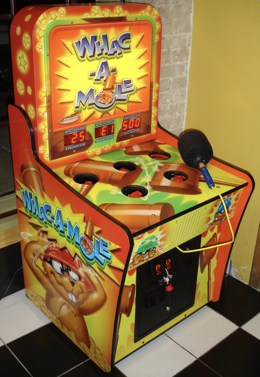
Running along with the theme of a video or arcade game with the promotion of the flu vaccination, I did some research into what possible arcade games I could take inspiration from to create my own. One arcade game that had particularly caught my attention was Whac-A-Mole. According to Higgins (2010) in an article published by Mental Floss,
‘Aaron Fechter invented the original Whac-A-Mole game in 1971. Well…he took the idea from “some Japanese guys” who had created a creature-whacking game first, but Fechter made the mechanism work reliably by inventing an air cylinder system to power the moles and an audio-tape-driven pattern that governed the moles’ timing. Also, Fechter’s game used only moles, rather than a variety of animals in the Japanese game. In the video below, Fechter (who went on to create the Rock-afire Explosion animatronic band for Showbiz Pizza) discusses how he created the Whac-A-Mole and how it was then reverse engineered and mass produced by Bob Cassata. Fechter ended up buying hundreds of the games from Cassata for his Showbiz Pizza parlors.’
The benefit with designing an arcade game based on the concept of the original Whac-A-Mole was that it would potentially attract all audiences. I found a few photos in which it showed people of different ages playing the arcade game. What was interesting was the ways in which the game had been modified, and much to my surprise had even been modified to fit in with different cultures.
This video shows that the game has been successful across different cultures and countries.
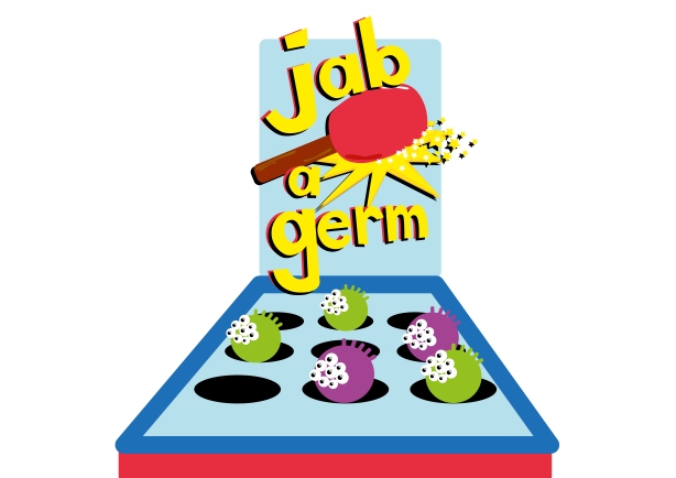
I started by developing a brief idea in Adobe Illustrator of what the game would look like in terms of what the characters that would pop up through the holes would look like.
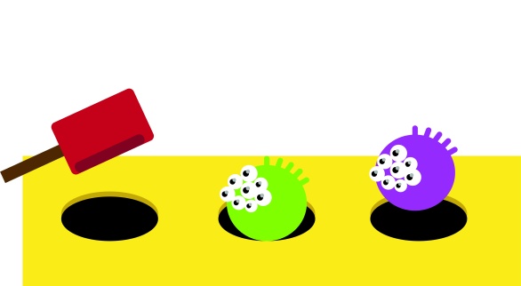
I had initially named the game Whack – a – virus, simply changing one of the words from the name of the original game. The arcade game would be a similar size to those that would be found in an arcade store, large and bulky. However, the game could have potential to be an app on a phone or a tablet, a computer game, or even a small board game. I designed the characters for the game so that they would correspond with shapes and colours you had seen in microscopic images I had found in my research from online.
I considered what else I could name the game after someone had said that my work didn’t seem consistent in terms of working together because I had decided use the arcade/video game theme with all my ideas. By looking back at the language I had used on the design of the plasters and badges, I considered what synonyms could be used for the word injection.
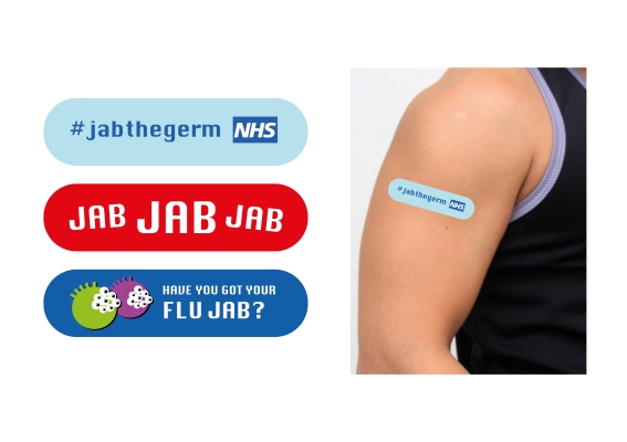
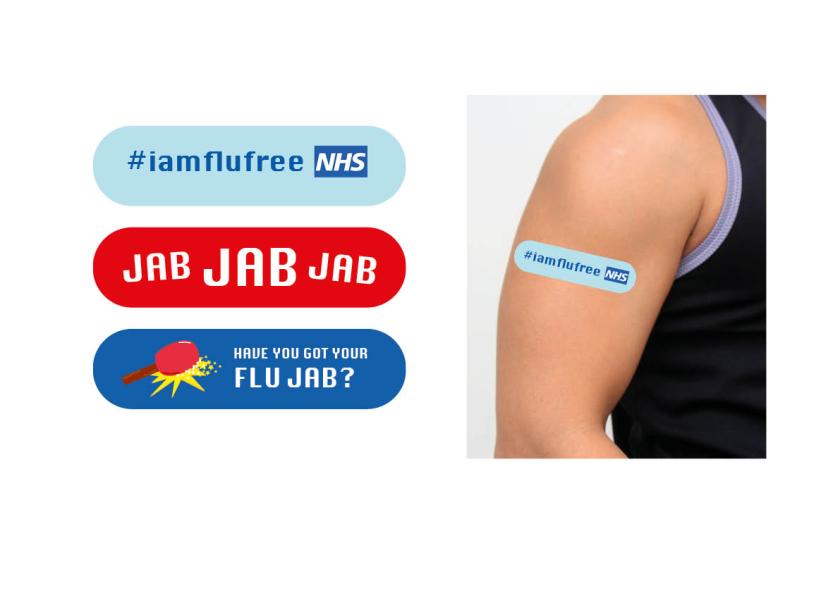
First I took a look at how I could make the collective design of the stickers more consistent. I had changed the word in the dark blue sticker from shot to jab so that it would fit with the words used in the red sticker.
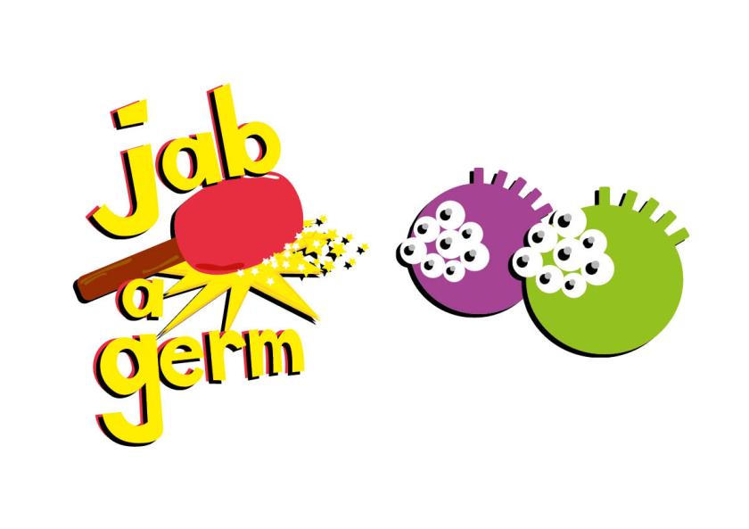
I then changed the name of the game from Whack – a – virus to Jab – a – Germ. I had considered how the design of the logo for the game could be changed, which involved changing the stars to a splatter of paint or goo, what would look like a germ that had been jabbed. I decided to choose the design featuring the stars simply because it looked cleaner and sharper than a splatter.
The characters that I have designed have many strong possibilities for developments. They could be featured in a children’s book, another concept for a game, or simple promotion such as keyring’s, plush toys, and stickers.
After conducting valuable research into Public Health Wales statistics and information regarding the flu virus, vaccines, and risk groups to narrow down a target audience, I started to search for inspiration and what previous campaigns had caught my eye.
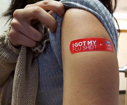
One of the websites that I had looked at in my research had an image featured of a plaster designed to encourage people to receive a flu vaccination. The language featured on the plaster may seem reassuring to viewers at first, however, it promotes the message that the flu virus is a much more serious issue than people may have originally thought. The fact that people receive a vaccination against a virus creates a sense of awareness that perhaps the virus may be causing more trouble than people would have originally thought, and if the vaccination is recommended by medical staff, pharmacists, researchers, or the government, campaigns designed to encourage people to receive a vaccination may therefore be successful, and in turn, preventing the virus from being spread because of herd immunity. As described by VaccinesToday, herd immunity is when a ‘high percentage of the population is protected through vaccination against a virus or bacteria, making it difficult for a disease to spread because there are so few susceptible people left to infect.’
The reason the language presented on the design of the plaster would be effective is because of where the viewer might be encouraged to read further about it. For example, the phrase presented on the plaster, ‘I GOT MY FLU SHOT‘, I feel inhibits the message ‘Did you get yours’, questioning the viewers decision as to whether to receive a flu vaccination. The language particularly looks at how the wearer of the plaster can spread a message which may not be directly spoken by them, however the words or images on the wearers body would encourage the viewer to receive the vaccination. This form of advertisement which would encourage people to receive their flu vaccination could act as a means of guerrilla marketing, because of the extremity that the designer or marketer has gone to promote the product or service. As described by creativeguerrillamarketing.com,
This alternative advertising style relies heavily on unconventional marketing strategy, high energy and imagination. Guerrilla Marketing is about taking the consumer by surprise, make an indelible impression and create copious amounts of social buzz. Guerrilla marketing is said to make a far more valuable impression with consumers in comparison to more traditional forms of advertising and marketing. This is due to the fact that most guerrilla marketing campaigns aim to strike the consumer at a more personal and memorable level.
Specifically looking at the remainder of the design of the plaster, it fully reads ‘I GOT MY FLU SHOT at (a particular aid).’ which would aid in helping the viewer choose somewhere to go to receive the vaccination.
Following my first project as part of ‘Who’s the Designer?’ module, I discussed how I wanted my research to influence my dissertation, and vice-versa. For my dissertation I had decided in my proposal that I wanted to assess the development of the history of the t-shirt, and more specifically the slogan t-shirt as a form of communication and how words can influence someone’s opinion or idea of the topic presented on the t-shirt and even the person wearing the item. I realised how the importance of spreading the question ‘ARE YOU AT WAR WITH YOUR BODY?’ could influence society and norms within that area of context. By designing a plaster, it would very much have almost the same significance and influence on someone’s opinion or decision regarding flu vaccinations and how important it is for those who are most at risk of catching the flu.
Instead of coming up with sketches I felt it was better to work straight into InDesign so get a real impression of what the design could be, in terms of type, colour, placement, language, and imagery. Based on what I saw of one of my group members, Tom’s work in the first client meeting where we had showed our work from our first persuasion project, I was inspired by how he used the video game theme to discuss the issue of the expense of a funeral and the burden of money left by the dead for their relatives to pay for the steep price of a burial or cremation. The client had shown great interest in the use of the video/arcade game style. Below are some initial designs I had come up with for placement onto a plaster.
One problem that may arise with encouragement being communicated through plaster design is the time of year people decide to get vaccinated to protect against the flu. According to documents I had looked at that were published by Public Health Wales, people who receive their vaccinations who are at greater risk of developing complications if they contract the flu, usually would be inoculated around October where the weather gets colder, in order to prepare risk groups for the Winter months. This raises issues as to whether the effectiveness of spreading a message on a plaster would be as effective as if the message were placed on a more visible and substantial form of communication, whether this be in the form of print or being designed to use digitally on computers, phones, tablets, etc.
I looked further into what other forms of communication would be more effective, and how an audience can be engaged into being vaccinated to protect against the flu virus. I considered how the designs I might create for plasters could be translated onto other similar deliverables, such as badges, stickers, and prescription packaging for drug boxes and paper bags.
The benefit of designing for stickers is that an adhesive sticker can be placed on almost anything. Stickers are cost effective and generally made of paper which makes them economical. These stickers could be given in a pack to children as a reward, placed on any prescription packaging, or stuck on documents or envelopes which could be sent in the post which would be particularly effect for those who find it difficult to leave their homes. If these designs were for pin badges then they would simply be effective as collectables for those who want to make a fashion statement, yet would ultimately be worn by medical staff so they would be worn when would be working to create awareness for their colleagues as well as patients, relatives, and those around them. Pin badges would create less waste than adhesive stickers because they would last longer and remain strong.
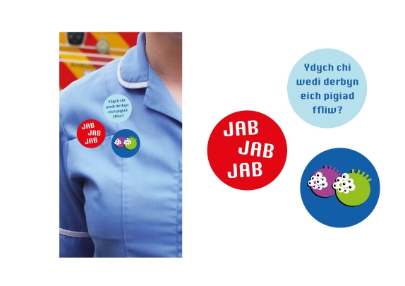
I translated the design of the plasters onto circular stickers/badges keeping the same background colours. For the lighter blue sticker, I wanted to see how well the use of the Welsh language would sit on a circular piece of ephemera. I translated the phrase ‘Have you received your flu injection?’ to Welsh. I needed to make the phrase simple enough for it to be translated effectively to Welsh in terms of the tone of the question and whether it would be understandable. One issue that may have arisen if I used a sarcastic tone of language is that it wouldn’t translate directly making it hard to understand when it came to a fluent Welsh speaker reading it. I kept the ‘JAB JAB JAB’ phrase on the red background, and only decided to use the image of the water pistol on the dark blue background. The reasons for choosing the colours of the backgrounds of the stickers and plaster was because it corresponded with colours someone would relate with the NHS which would be the direct place someone would go to receive their vaccination.
After going to a tutorial I was complimented on the fact that I had chosen to design for a plaster for the effective reason that it would act as a reward to the patient when they received their flu jab. This reward would trigger a nostalgic moment to your childhood when you would perhaps be given a patterned plaster after an injury, or a lollypop you would be given after a consultation with a doctor or nurse. One problem that the tutor had raised was the fact that I decided to use the water pistol emoji in the design of the plaster/sticker. Not because it was designed by someone else, but because it could have raised awareness on the issue of gun violence, or it would even promote gun violence. I would need to think of another image and phrase to encourage the audience to get their vaccination.
The meeting with the client involved a brief chat regarding a document published by the Welsh Government, with NHS Wales and Public Health Wales, that evaluated the resilience of health and care services in Wales concerning the Winter months between 2016/17. This document would help in finding a way to improve healthcare services in Wales in years to come. Specifically, the document allowed officials, staff and public to look at various statistics and important cases that were deemed a danger to the public in order to grasp a sense of what actions needed to be taken in order for the NHS to work more efficiently and effectively.
In chapter 10. Influenza and Infection Control starting on page 59 of the document, the government looked more specifically at what influenza was, what effect it has on the public, and ways in which the virus can be prevented from spreading.
Influenza, commonly known as flu, affects the respiratory system (lungs and airways). It is the result of an infection that is caused by an influenza virus of either two types that affect humans. These are known as influenza A and influenza B, however, there are a range of differing sub-types within group A and B. This is because of a continual genetic change where the virus evolves and adapts to different conditions or attacks on the virus; as any other virus would. Symptoms of flu include:
fever
chills
headache
cough
body aches
fatigue
sore throat
The virus spreads in October and April, being spread easily from person to person. Flu has a significant impact on the building pressures on the NHS between December and March. Because of the genetic change a virus can take, people who have been immune to the virus in previous years can not be guaranteed to encounter it in the future. Therefore a new vaccine has to be developed each year to protect those vaccinated from viruses likely to be circulated in the following critical months of obtaining the flu. Those of the public who are most vulnerable to getting the flu include children between the ages of two and seven years of age, anyone over the age of 65, pregnant women, those under the age of 65 who would be likely to develop complications from the results of contracting the flu virus, and also health and social care workers who care for those that are vulnerable. The vaccination is offered free to the vulnerable.
I continued conducting research into the flu and looked on the official NHS website. The webpage provided more information in regards to giving information on what to do in the situation of dealing with the flu. This included more detail into symptoms of the flu, how to treat the flu yourself, how a pharmacist could help, when you should seek medical help and important information about how antibiotics won’t be able to help with the flu, how to avoid spreading the flu, and how to prevent it. Highlights of the webpage were boxes which featured important phone numbers, who is most at risk of developing complications, and when someone should call 999. The NHS mostly encouraged people to call 111 if they couldn’t seek access to speaking to their GP. The client at the first meeting had also mentioned that people who are suffering from the flu have seen the need to visit A&E instead of seeking help elsewhere. What I believe would be necessary is including information about the flu as well as encouraging people to get a vaccine to protect themselves from the virus, as to what was mentioned in the briefing.
I wanted to take a quick look at what the flu virus looked like under the microscope. This would give a possibility of me developing some interesting outcomes with regards to how I would use shapes, colours, and images. I referred to the CNN Website where a gallery of eight images were shown along with captions underneath.
Antibiotic resistance was an important topic brought up by our client in our first meeting. I visited a webpage where a short article was written, titled ‘Why Don’t Antibiotics Kill Viruses?‘ The article generalised how your body would become resistant to an antibiotic while doing nothing to improve symptoms of a viral infection. It explained this through a number of different reasons as to why viruses are resistant to antibiotics.
Antivirals would sometimes be prescribed to shorten the lifespan of the virus to help prevent further complications from arising, however it would needed to have been taken within the first 24-48 hours of the infection. An antibiotic could be prescribed later when the virus has encouraged a bacterial infection to grow, however it would not kill the virus. This is because viruses are structurally different from bacteria. Instead, viruses adapt and replicate to the conditions of a human cell. This is where vaccines would be effective because they contain antiviral ingredients. A vaccine works by stimulating the immune system so that cells can recognise and produce antibodies to fight off a future attack from a virus which could cause disease.
Another point that also came up in the meeting was sharing antibiotics with different people for when they contract a bacterial infection. Unfortunately not all bacterial infection will be killed by any antibiotic. A specific antibiotic would be prescribed to someone with a certain infection. The same article gave an example:
For example, amoxicillin (a penicillin-type drug) can be used to treat a strep throat but will not work for some common pneumonias or bladder infections. This is one reason why it is very important not to share your antibiotics with someone else. While you may mean well, the bacteria causing their infection may not be susceptible to your prescribed antibiotic. In turn, those bacteria may not die, and the infection can worsen. Plus, the person you share your antibiotic with may unnecessarily experience side effects from your drug. (https://www.drugs.com/article/antibiotics-and-viruses.html)
Further mentioned was the problem of the bacteria learning to ‘fight off’ the antibiotic by developing protective walls that can inactivate the antibiotic. Therefore, sharing antibiotics you have been prescribed is dangerous to the giver and receiver because the bacteria will fight off the antibiotic before you finish the course you will have been prescribed.
In more specific relevance to the brief, I briefly looked at controversy created by the media that has discouraged people to be willing to get a vaccination to protect them the flu. In an article written in the USA, the author has researched and discussed how many people have died from the flu every year since 2010, how controversy has piled up around vaccinations, and why this controversy still exists. Two factors were mentioned that contributed to vaccine hesitancy. They mentioned how a study from 2013 had found that people who are hesitant to getting the vaccine tend to rely on the internet as a source of information, even though the internet is filled with misinformation presented by the media and theorists. The second largest factor that was mentioned was a study that had investigated how the MMR (measles, mumps, and rubella) vaccine was a cause of autism in children that was written in 1998 by Dr. Andrew Wakefield, who has since been discredited by the British Medical Journal (BMJ) for fraudulent research. Due to the uproar of media on this case, despite the research being proved fraudulent, vaccinations dropped both in the US and the UK. Vaccination rates dropped so significantly in the UK that in some areas only 60% of children were being vaccinated, according to the BBC.
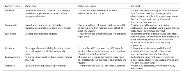
In an editorial published by the Edward Jenner Society, I saw a table which presented the types of fears that trigger vaccine hesitancy by different causes. What I liked about the content provided by this editorial was that it had offered solutions to how people can be encouraged to get a vaccine by persuasion, which would be very useful for the remainder of this project and future persuasion projects to come.


 One problem that may arise with encouragement being communicated through plaster design is the time of year people decide to get vaccinated to protect against the flu. According to documents I had looked at that were published by Public Health Wales, people who receive their vaccinations who are at greater risk of developing complications if they contract the flu, usually would be inoculated around October where the weather gets colder, in order to prepare risk groups for the Winter months. This raises issues as to whether the effectiveness of spreading a message on a plaster would be as effective as if the message were placed on a more visible and substantial form of communication, whether this be in the form of print or being designed to use digitally on computers, phones, tablets, etc.
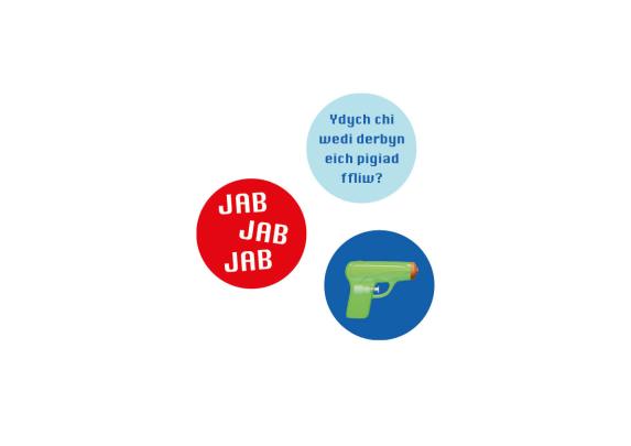

