Working from the sketches of initial ideas I had for the project, I focused on putting the designs together. I knew I wanted to use positive colours for my first digital designs of the poster, t-shirts, and badge design. Looking back to the research I had conducted into existing designers work, I made the choice of using a mix of serif and san serif typefaces to make the designs eye-catching. By using yellow and pink it made the words stand out from the background. After a group tutorial, I was given the suggestion to use images in my designs, then explaining that I decided it was best not to use images because I didn’t want to present an ideation of an ideal body shape. And because of the seriousness of the campaign I wanted to portray, I decided only to use words. Then the tutor suggested that I perhaps would remove the preposition ‘VS.’ to instead visualize it in the form of a shape or picture.


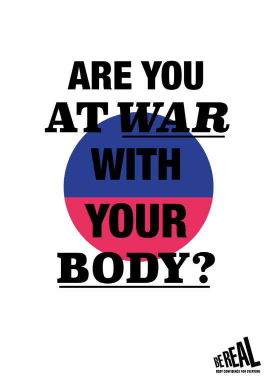
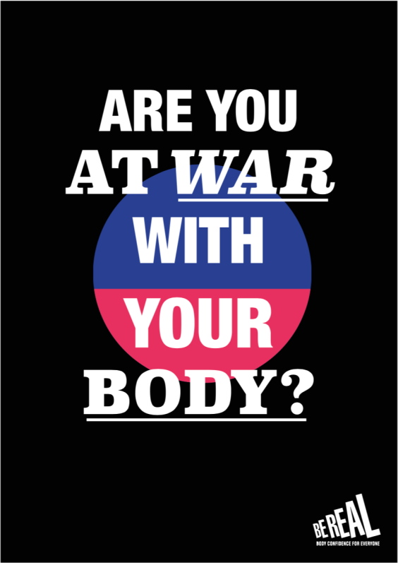
My initial idea after the tutorial was to use a different idea I had sketched out before I started developing digitally. I had completely transformed the image of the campaign by using darker and fuller colours that reflected the strength I wanted to portray with the message of the campaign. By instead using the posing question ‘Are you at war with your body?’ it would make the poster and wearables more personal to the viewer and wearer of the t-shirt and badge.


Just by chance, I had discovered another new design for the campaign. And this design would give deeper and stronger meaning. I tried to see whether I could make the badge stencil easier to place on documents by instead turning the shape into a vector image instead of a stencil of a circle placed over the block colour shapes used in the background. I had pasted the text into an InDesign document which was far too large to sit within the badge, and then I looked at the design a different way. Although it reminded me of the South Korean flag, it looked much more like a medicated tablet or pill that someone would take. This tablet could have represented steroids that men use to make their bodies look more muscular, or it could have represented a tablet that someone would take to cure a mental illness or disorder. What I loved about this idea was how inclusive it would be to all audiences, although the campaign was aimed at 12-17 year olds. The fact that I was using blue and pink as the colour for the shape, targeted both males and females. And the benefit of using two colours for the shape means that it would be easily changeable, to look further towards other colour combinations, such as orange, green, purple, or yellow. I would keep the design of the badge the same since the circle would be too small to make out if it were placed in those dimensions. Regarding the structure of the type, I used Superclarendon in Black for the serif font, and then Helvetica Neue in Condensed Black for the san serif font. For the word ‘WAR’, I decided to make it italic and underline it to provoke the seriousness of the issue at hand. I also needed to reduce the kerning when making the word italic, since the letters were too far apart otherwise. I underlined the word ‘BODY?’ as well. As in previous designs, I had vectorized the BeReal logo so that I could adjust the size of the marque without making it pixelated.
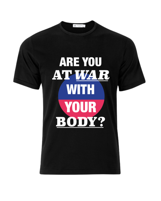
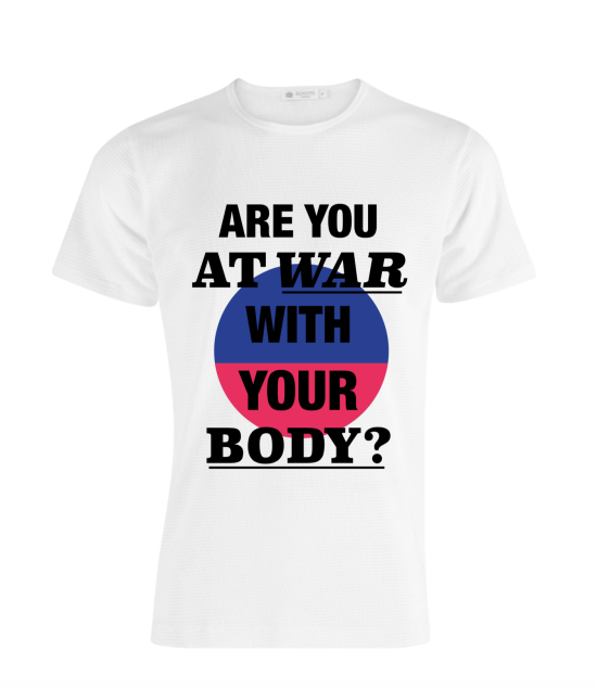
I was extremely happy with the outcomes I came up with for this new campaign for BeReal. It gave the campaign and new image and more importantly a new meaning to the issue to body confidence and mental health. More importantly, the seriousness of the message I portrayed can communicate effectively with the target audience and any viewers the campaign can garner. I really like my final designs for the campaign as the effectively communicate deeper messages through the use of colour and shape. By using the combination of shape, colour, and type, it makes the campaign recognizable and memorable. I felt as if I could have made smarter and better use of at least one image within the campaign to attract a stronger message.
